I have been terribly remiss in not posting anything for such a long time. But I got caught up in the process and then started feeling the time crunch - tomorrow is my LAST day here in the studio ....
It pleases me no end to be able to say I've done pretty good time-wise, with 14 books finished before I leave. So from now on I will aim to post one finished book a day.
In the meantime you might enjoy the article that Jenn Bratovich, the WSW Blogess, wrote about my time in the studio:

Holland-born book artist Merike van Zanten loves a good challenge. So after a career in business and banking, she “came to her senses” and pursued a fine art education—at age 42. “I was twice the age of everyone else,” she says. “I was like everybody’s mother!”
After a year of foundational coursework to learn basic studio practices, Merike discovered ceramics, which allowed her to really engage with her materials and to begin doing what she now considers integral to her practice: experimenting. She spent the rest of her time in school casting, hand building, and blowing things up with fireworks.
“I thought there were a lot of rules in art, but I didn’t know what they were,” says Merike, who was soon combining thin sheets of lead with her ceramic forms. “I didn’t realize that you could follow your instincts, your gut feeling—so I was very by the book. I very quickly let go of that.”

The fact that Merike has a sculptural background is hardly surprising; many of her artist’s books have pushed the limits of the book form. Her piece
“Lover’s Game” is a repurposed vintage two-drawer cabinet that once held watch parts in small glass vials, but now serves as a set of fragmented words and phrases meant to be arranged and rearranged by the viewer (reader). In other books, the structures take unusual shapes and narratives unfold in nontraditional ways:
a house that opens up through the roof to reveal vintage land search documents, or
a round carousel of portraits with drawers that hold objects revealing family secrets.
Are they books? Sculptural objects? For Merike, the differentiation doesn’t matter and often collapses. “The book, for me, doesn’t need to look anything like a book,” she says with a shrug.


During her five-week
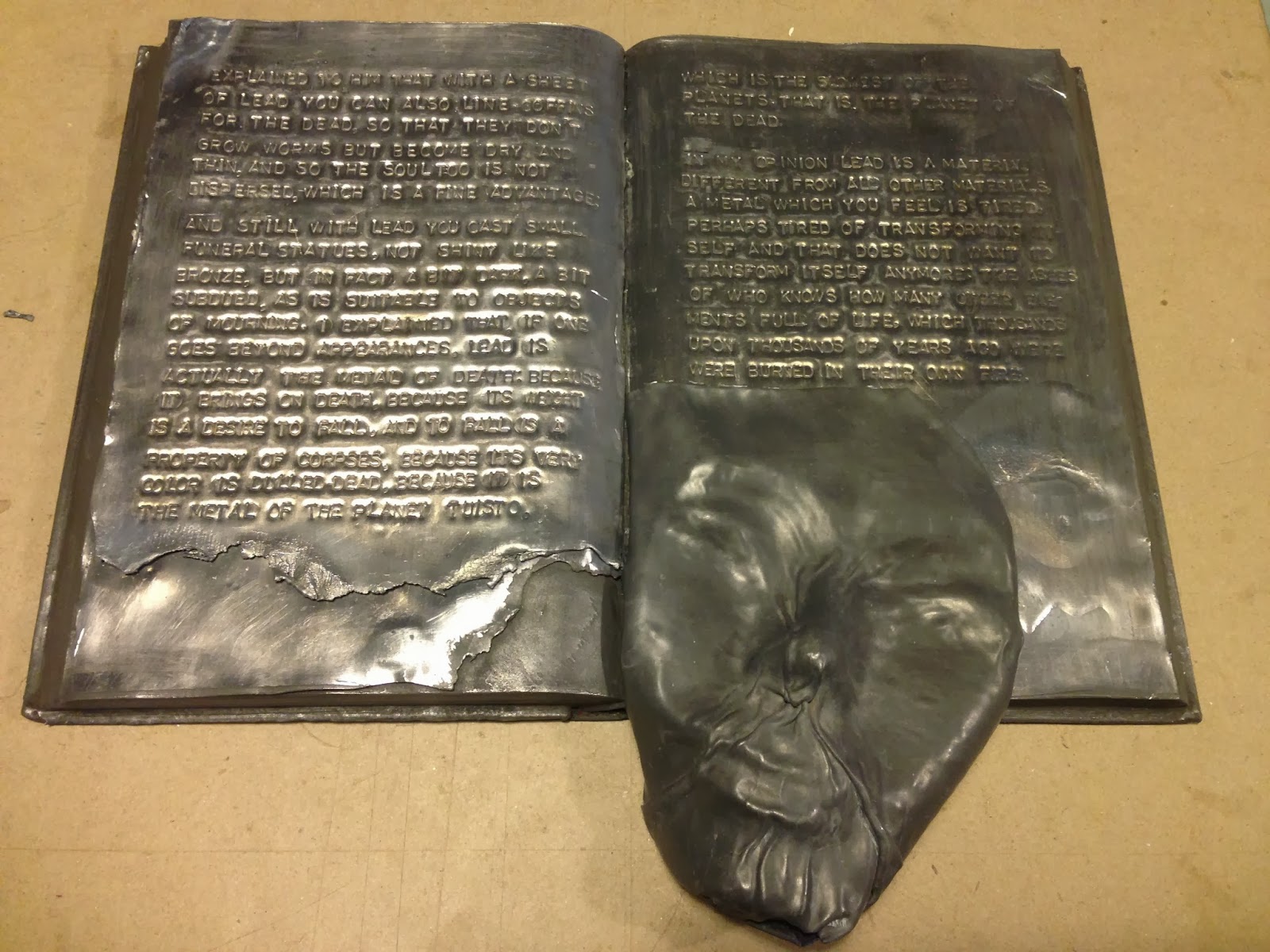
Workspace Residency, Merike has been working on a series of books that do look like books, but with a twist. Using a set of encyclopedias as her base, Merike has glued, gessoed, excised, blown up, and otherwise transformed 14 books into a series that guides viewers along visual and textual representations of living with debilitating clinical depression. It’s a project that has been a long time in the making and hits close to home: she’s aiming to illuminate an experience that Merike says is “difficult to explain, and difficult to understand.”
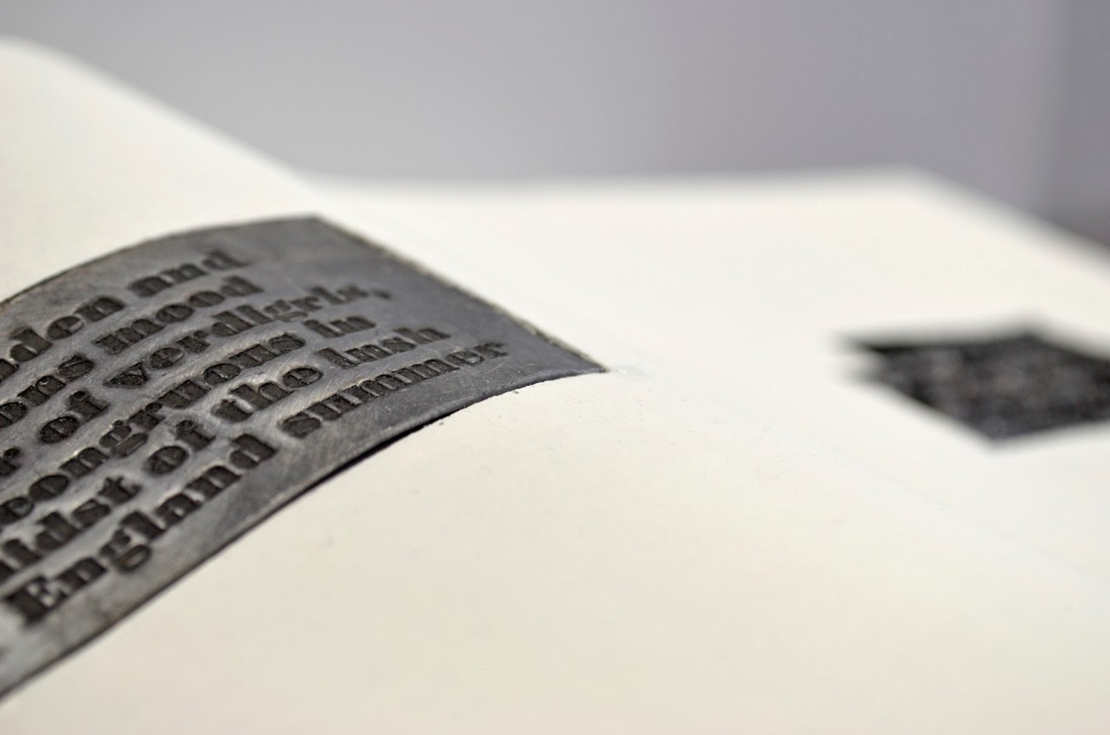
Each book, splayed open in the middle, is different. Text spirals out of one in a frenetic swarm. A ceramic head wrapped in wire sits atop another. One is a dull heavy gray, a lead sheet full of hand-stamped text forming its top layer. Others are delicate white on white. Quotations from sources ranging from Dr. Seuss to J.D. Salinger are stamped into small lead sheets, resting like plaques against the whitewashed pages. Years after first experimenting with it in art school, Merike is still drawn to lead for its malleability and softness, as well as its toxicity.

Merike has removed one book from the series that has elicited
oohs and
ahhs from just about anyone passing her workstation in the last few weeks. What resembles a curling paper flower blooms out of the pages of a book Merike tried to blow up. But it didn’t explode quite right and it doesn’t fit in: everyone keeps thinking it’s meant to be a flower. The decision to move on was easy.
“I learned this in ceramics, because you can trip and drop a piece and it’s gone,” she says. “Never be precious about anything you make.”
Process-driven and adventurous, Merike is motivated by the challenges of new techniques and materials. The range of her practice (also including collage,
sculptural papermaking, and
eco printing) is proof of that spirit. And so are her journals: fat, colorful handmade books packed with collaged papers and images, with found objects poking out of the pages:, a place to simply engage with new materials. Sometimes new ideas come from the journal. Sometimes they don’t.

“I am getting more and more intuitive. I
need to do new things; I love figuring out a new process,” says Merike. “When I go for something, I go a hundred and ten percent.”
Merike van Zanten is a Dutch mixed-media artist who holds a BA (hons) in ceramics from University for the Creative Arts in the UK. She is based in Massachusetts, and has work in private collections in the Netherlands, England, and the US. If Merike could sit down for coffee or tea with any women artists, she would choose Robbin Ami Silverberg and Lynn Skordal. See more of Merike’s work at www.doubledutch-design.com and check out her blog for more on her project.






 Posts
Posts


